EuroSTAR 2022 RisingSTAR Winner, Kimberly Snoyl, is continuing to develop her original idea ‘to create a HeuriChecker to Automate the Usability Heuristics’ (see more details). You can find out more about this award on our main RisingSTAR award page. Kimberly is currently working on a web based tool called ‘Ladybug’ that will be accessible for everyone. She held a workshop in January 2024 to explore the initial approach, get feedback and create a roadmap on how to start this as an open source project. Below is the outcome of this workshop.
Update
On January 10th we had a Kick-off workshop for the ladybug. The goal for this workshop was to find a group of people who are enthusiastic and who want to pitch in to bring “The Ladybug” to life!
We started out with a brief introduction: everyone could make a profile, so we could see who joined the workshop and what their roles and superpowers are. There were 7 people who participated in the workshop: 2 Testers, 3 UXers, and 1 Dev and myself (Testing & UX)
Unfortunately, we did not have as many Developers join as have RSVPd, so we were very happy with having one developer present. Therefore the view of the developer was only from one perspective. Also, we wanted to know the technical possibilities and get more technical people on board to start creating the tool. Hopefully next time more developers are willing to join! We’d also like at least one product owner to join us.
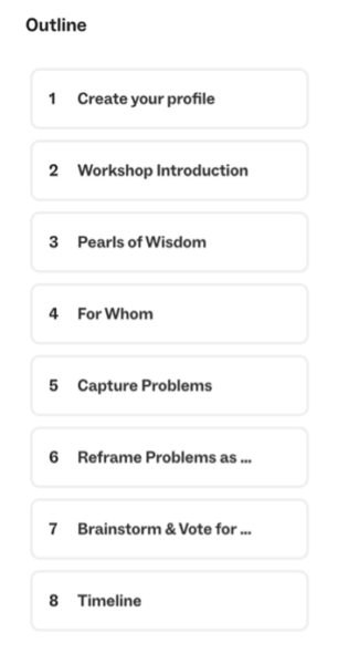
Figure 1 Outline of the workshop
After filling in our profiles, I gave some information about the idea for the Ladybug and its background. Then we started with the first nut to crack: The target groups.
The target groups
Before the workshop I identified 4 target groups: Testers, UXers, Product owners and developers. But since there were no product owners present, we only made empathy maps for the other three.
An Empathy map helps us empathize with the user, to identify their needs and frustrations. What we have learnt in making these empathy maps is:
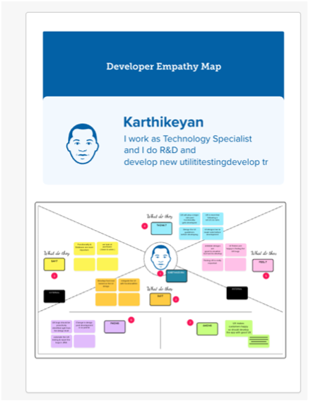
Developers find UX important, but it can make their work more difficult because it might look good with a design tool but building it with code can be hard. Fixing UX findings after development is painful, UX bugs should be identified at the design level. So, what we can learn from this is that UX and developers should be communicating more. While with this tool I have just been focusing on bringing Testers and UX together, maybe it has a role in bringing UX and Developers together too. It is valuable to learn that Developers are very important stakeholders and potential users as well.
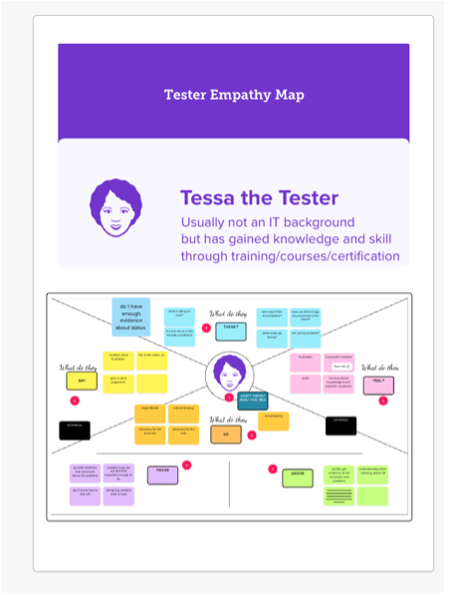
Figure 2 Empathy map for the developer
My earlier assumptions on the pains and gains of testers were confirmed: testers don’t know how to test UX, and if they find UX bugs, they are not important enough to the business. Testers lack the knowledge to convince the business about the importance of UX. The empath map showed that testers have feelings of insecurity which I underestimated: Imposter Syndrome and also something new to me: the Cassandra metaphor: a person whose valid warnings or concerns are disbelieved by others. This might be another requirement for the Ladybug to consider: helping testers feel more secure about the findings and how to convince their stakeholders.
Figure 3 Empathy map for the Tester
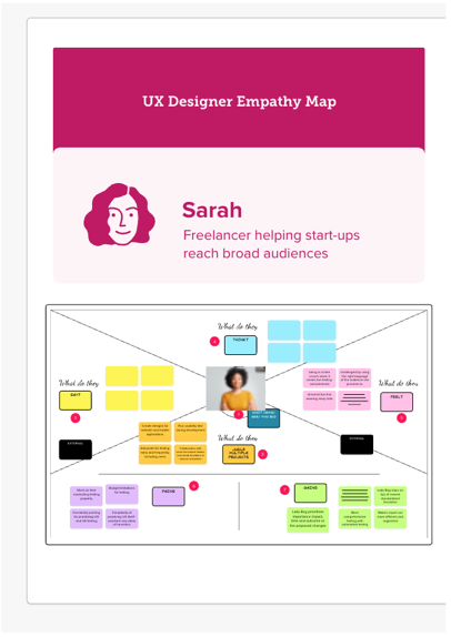
Since the idea that this tool could also be beneficial for UX Designers is quite new to me, the findings from the workshop are interesting as well: UX Designers are also in a time squeeze: they may juggle multiple projects and always have to be the one who pushes for the importance of UX and be an advocate for the user. It would help them if the Ladybug tool was always on top of newest standardized heuristics (So it knows things that the UXer maybe does not know yet, like new trends in the UX market). Also, it would be helpful if the Ladybug prioritizes the importance, impact, time and outcome of the proposed changes. And again, of course Ladybug should take off the load of testing, save time and make it more efficient to catch bugs.
Figure 4 Empathy map for the UX Designer
Problems and challenges
Since we were with a small group, we did not choose one target group, but went on with all this new knowledge to capture problems and afterwards to positively rephrase them as “challenges”. We used Isabel Evans’ 12 heuristics of tool design (work in progress)[1] (see Figure 5) as inspiration of which problems/challenges to think of.
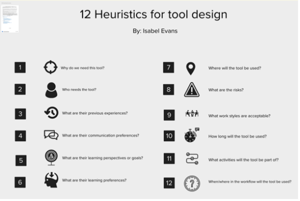
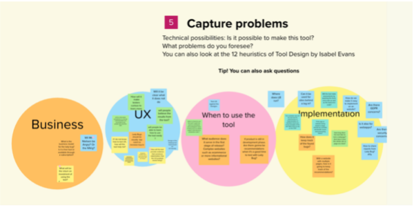
Figure 5 Heuristics of tool design by Isabel Evans1 Figure 6 Problems captured during the workshop, divided in 4 groups
The brainstorm listed issues that could be divided in four categories (See Figure 6):
Business:
- Legal: Do we need consent from Nielsen?
- What is the business model and return on investment?
UX:
- The tool should be well designed, accessible, clear and user friendly, but also some new insights came up: Apparently there is a greater need for knowledge on how to test UX instead of automating all the tests.
- So, there is a need for transparency and they want to gain knowledge from the tool.
- And of course: they need help with convincing their stakeholders/business on why the UX finding is important to solve and examples on HOW to solve it.
When to use the tool:
- Test Wireframes & UX Designs?
- Development phase: OTAP environments?
- What type of websites? E-commerce or informational websites?
Implementation:
- Website behind a Login
- Performance
- Accessibility
- Security, GDPR concerns
- How? Only CSS? Front-end and Backend code?
After reframing the problems as challenges, we ended up with the following challenges:
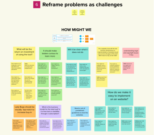
Figure 7 Reframe problems as challenges
Business
- How might we ensure we are legally and morally above board with all parties?
- How might we make the Ladybug as available as possible while covering costs of its ongoing maintenance/update?
- How might we align Ladybug to common business values: increase revenue, save costs, higher customer satisfaction (NPS), sales/marketing opportunities?
- How might we advertise the value of the tool to bring in users?
UX
- How might we educate users in an engaging and interesting way?
- How might we use Ladybug to broaden people’s thinking about UX?
- How might we make it clear what the tool is NOT intended to be used for (to avoid misuse and disappointment)?
- How might we inform the client at the right moment, so they won’t be disappointed and still interested?
When to use the tool:
- How might we decide if Ladybug should be running (or ran?) server side, client side, both or something else?
- How might we make it easy to implement on one’s own server?
- How might we understand what websites are suitable for the Ladybug to test?
Implementation:
- How might we also make it top notch appealing for non-visual users of the tool/reports (accessibility)?
- How might we establish rules or guidelines to test visual consistency across the website?
- How might we establish guidelines to test consistency & standards across different categories such as text, visual elements?
Solutions
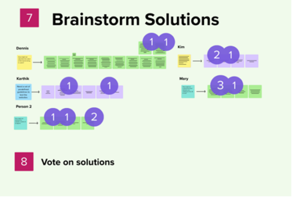
Figure 8 How the Solutions we brainstormed looked like, including the dot votes
Afterwards we chose one challenge out of each category and brainstormed solutions. We came up with the following solutions:
Business
- We could choose what to emphasize: e.g. Customer Satisfaction, User Retention, Reduced Support Costs, Increased Productivity, Competitive Advantage, Customer Loyalty etc.
- We could emphasize how Ladybug will make your life as UX designer/developer/tester/product owner better, as usability testing can be done faster and with evidence-based UX.
- We could do user research, we could do usability testing, we could get some great designers on board, we could look at tools we admire.
When to use the tool:
- We could research the different kinds of websites, e.g. e-commerce sites, blogs, social networking, corporate, etc. then categorize by complexity in terms of content or size or a similar metric, we could gain insights from developers.
Implementation
- We could research how other similar tools do that (e.g. accessibility automation tools)
- We could refer to WCAG Guidelines.
- We could get a dump of frequently occurring UX bugs & turn it into requirement guidelines.
MosCow prioritization
In the end we voted on the most important topics and ended up with four actions. We plotted them on this impact-feasibility prioritization matrix (see Figure 9) and all of them ended up in the high impact, high feasibility square (Best Bets)!
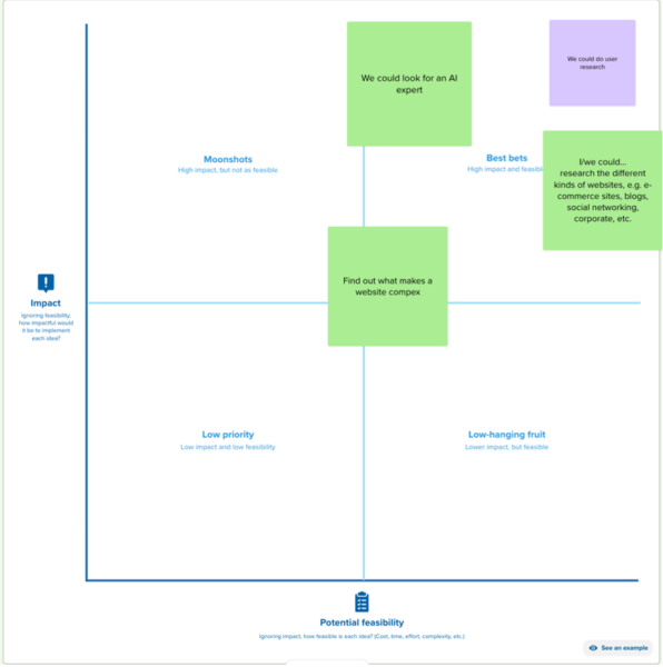
Figure 9 Impact-feasibility map with 4 plotted items
As you can see in the sum up table Figure 10, we converged in the process: We started broad with problems and challenges, and then narrowed down with each step until we got four action points to leave the workshop. This gave us clear starting points. If you want to help us with one of these four starting points, or think your help could be elsewhere, please reach out via kimberlysnoyl@gmail.com or connect on GitHub.
What’s next?
In the next meetup on April 3rd, we will have a work session in which we will go through different websites and find out what type of websites there are, what type we can and cannot test with the Ladybug and why. You can join the Meet-Up by clicking this link.
Parallel to that it is of course very important to have the guidelines. Since I wrote an article in Application Unleashed magazine on this topic, the Usability Research team at the Dutch Police (where I also currently work) reached out to me and are willing to also organize some work sessions where we do Expert reviews on different (Police) applications and websites, with the goals to:
- Document how experts do an Expert Review: what steps do they take? Do different experts follow different steps? Do they take steps that are not documented by Nielsen?
- Document the findings so that we can compare the outcome of the tool to the findings of the experts and see if the tool works as expected.
Additional remarks:
Thanks to this workshop we see that there is still some research that needs to be done, which we do not want to step over. What target groups do we want to cater to? We will not be able to do everything at once, but it is important to consider the end goal in the first setup of the project.
Also, like most change in the mindset of a company, it is important that UX is driven from the business perspective (top up) as well as from the development team (bottom up). If the business does not find it important to begin with (Like performance, Security etc.), it will not work, but also if the developers, testers and UXers do not advocate for the importance of UX, it will also not change.
Attachment 1:

Figure 10 Overview of the problems, challenges and solutions that were brainstormed during meetup 1
[1] Evans, I., Porter, C., & Micallef, M. (2024). Heuristics-for-test-tool-design (Version 1.0.0) [Computer software]. https://github.com/hci-lab-um/heuristics-for-test-tool-design
The EuroSTAR 2024 RisingSTAR Award is open for entries 5th March – 5th May 2024. View the details and consider submitting your idea for the Supporters/Mentors to vote on.
